In Praise of Helvetica
Remembering Massimo Vignelli

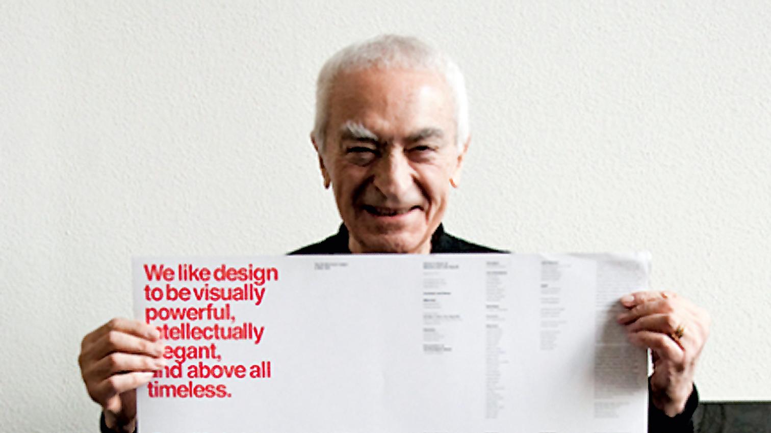
If two things can synthesize the work of one man, then for Massimo Vignelli, the internationally known graphic designer, those two icons would be the Swiss type of Helvetica and the color Super Warm Red. The first issue of Oppositions, the now well-known journal of the Institute for Architecture and Urban Studies in New York, was designed with a gray cover and in Times Roman type. When the dummy copy arrived, we realized that we – architects – knew nothing about graphic design, and that we needed the eye of a professional. That professional was Massimo Vignellli. Over our muted protests, he changed the cover color from gray to Super Warm Red, a color made especially for Vignelli, and the typeface to Helvetica. This began a lifetime of design with Massimo, who contributed to every scrap of the Institute’s printed matter, from books to posters to invitations.
Each time a new issue of Oppositions was ready to be designed, Julia Bloomfield, the managing editor, and I would trudge over to Vignelli’s office. And no matter what Massimo was doing, he would drop everything and spend the whole day with us, methodically laying out every page. All of this happening to the consternation of his office manager and his partner and wife, Leila Vignelli. After all, the Institute was not a paying customer (it was never charged even one dollar). But to see the energy and enthusiasm Massimo had for this work was something special; with every issue, he was almost like a child with a new toy.
Part of this work was, for Massimo, done out of friendship and camaraderie, but part was a genuine opportunity to take often radical commentary and mold it through a consistent and rational aesthetic into something that, at the time, had been unseen in American architectural journalism. Certainly any such radical program becomes formulaic over time, and this was certainly the case with Oppositions, but this did not dim Vignelli’s ardor. What was original became a signature, not so much of Vignelli as of the Institute itself – what today might be called its brand.
After working with the Institute, Vignelli continued not only with my architectural office but also with Richard Meier. All of his books for us were in his characteristic square format, with Helvetica and Century Expanded fonts, emphasizing white for Meier’s monographs, or double hits of black and warm red for my own Terragni and House X books. Always, the same energized intensity came through.
Looking back and thinking of Vignelli’s passing, it is obvious that what he did – and what cannot be done today – was to invent in graphic form an ethos of architecture that still permeates professional presentations, in print and online. Vignelli himself is no longer among us, but his aesthetic lives on.


